Appearance
CSS-position 关键字
position 属性
| 值 | 定位参考 | 是否脱离文档流 | 常用场景 |
|---|---|---|---|
static | 无(正常流) | 否 | 默认值,重置定位 |
relative | 自身在正常流中的位置 | 否(保留占位) | 微调元素、作为绝对定位的包含块 |
absolute | 最近的非 static 祖先 | 是 | 弹出层、图标、悬浮元素 |
fixed | 视口(viewport) | 是 | 固定导航栏、回到顶部按钮 |
sticky | 滚动容器 + 父容器边界 | 否(混合) | 吸顶效果、表头固定 |
static
static 是 position 属性的默认值。如果省略 position 属性,浏览器就认为该元素是 static 定位。
这时,浏览器会按照源码的顺序,决定每个元素的位置,这称为 "正常的页面流"(normal flow)。每个块级元素占据自己的区块(block),元素与元素之间不产生重叠,这个位置就是元素的默认位置。
在 static 状态下 top、bottom、left、right、z-index 这四个属性无效。
relative
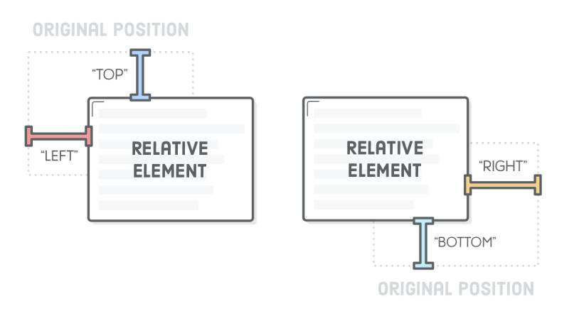
相对于默认位置进行偏移,元素仍在文档流中,保留原本占位空间。必须搭配 top、bottom、left、right 这四个属性一起使用,用来指定偏移的方向和距离。
absolute
相对于上一级元素 进行偏移,元素完全脱离文档流,不占据空间。
定位参考:最近的非 static 祖先元素(即 position 为 relative、absolute、fixed 或 sticky 的祖先)。如果不存在,则相对于 初始包含块(通常为 <html> 或视口,不同浏览器略微差异)。
absolute 定位也必须搭配 top、bottom、left、right 这四个属性一起使用。
html
<style>
    .parent {
        position: relative;
        width: 300px;
        height: 200px;
        background: pink;
        left: 50px;
    	top: 50px;
    }
    .child {
        position: absolute;
        bottom: 10px;
        right: 10px;
        background: red;
    }
</style>

<div class="parent">
    <div class="child">绝对定位元素</div>
</div>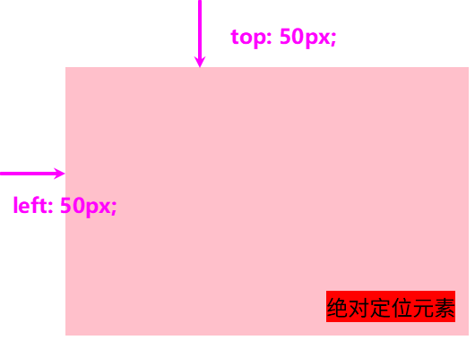
fixed
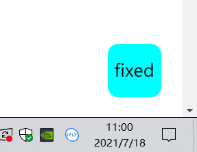
fixed 表示,相对于视口(viewport,浏览器窗口)进行偏移,即定位基点是浏览器窗口。 它如果搭配 top、bottom、left、right 这四个属性一起使用,表示元素的初始位置是基于视口计算的。滚动页面时,元素位置固定不动。
常见:顶部导航栏、右侧悬浮客服按钮、回到顶部按钮。
css
.fixed-header {
  position: fixed;
  top: 0;
  left: 0;
  width: 100%;
  background: white;
  z-index: 1000;
}
sticky
sticky 表示混合模式,即 相对定位+固定定位 的效果。
它的具体规则是,当页面滚动,父元素开始脱离视口时(即部分不可见),只要与 sticky 元素的距离达到生效门槛,relative 定位自动切换为 fixed 定位;等到父元素完全脱离视口时(即完全不可见),fixed 定位自动切换回 relative 定位。
sticky 生效的前提是,必须搭配 top、bottom、left、right 这四个属性一起使用,不能省略,否则等同于 relative 定位,不产生 "动态固定" 的效果。原因是这四个属性用来定义 "偏移距离",浏览器把它当作 sticky 的生效门槛。
css
#toolbar {
  position: -webkit-sticky; /* safari 浏览器 */
  position: sticky; /* 其他浏览器 */
  top: 20px;
}上面代码中,页面向下滚动时,#toolbar 的父元素开始脱离视口,一旦视口的顶部与 #toolbar 的距离小于 20px(门槛值),#toolbar 就自动变为 fixed 定位,保持与视口顶部 20px 的距离。页面继续向下滚动,父元素彻底离开视口(即整个父元素完全不可见),#toolbar 恢复成 relative 定位。
例子
html
<!DOCTYPE html>
<html lang="en">

<head>
  <meta charset="UTF-8">
  <meta http-equiv="X-UA-Compatible" content="IE=edge">
  <meta name="viewport" content="width=device-width, initial-scale=1.0">
  <title>Document</title>
  <style>
    .container {
      width: 500px;
      height: 1500px;
      border: 1px solid red;
      /* 相对于根html节点 */
      position: relative;
      left: 50px;
    }

    .name {
      position: relative;
      left: 50px;
    }

    .box {
      width: 200px;
      height: 200px;
      border: 1px solid blue;
      position: absolute;
      left: 50px;
    }

    .navigation {
      width: 50px;
      height: 50px;
      border-radius: 10px;
      background-color: aqua;
      text-align: center;
      line-height: 50px;
      position: fixed;
      bottom: 20px;
      right: 20px;

    }

    .toolbar {
      width: 500px;
      height: 50px;
      background-color: rgba(127, 255, 212, 0.5);
      border-radius: 10px;
      text-align: center;
      line-height: 50px;

      position: sticky;
      top: 0px;
    }
  </style>
</head>

<body>
  <div class="container">
    <div class="name">郑宇</div>
    <div class="box">absolute</div>
    <div class="toolbar">toolbar工具栏(sticky)</div>
  </div>
  <nav class="navigation">fixed</nav>
</body>

</html>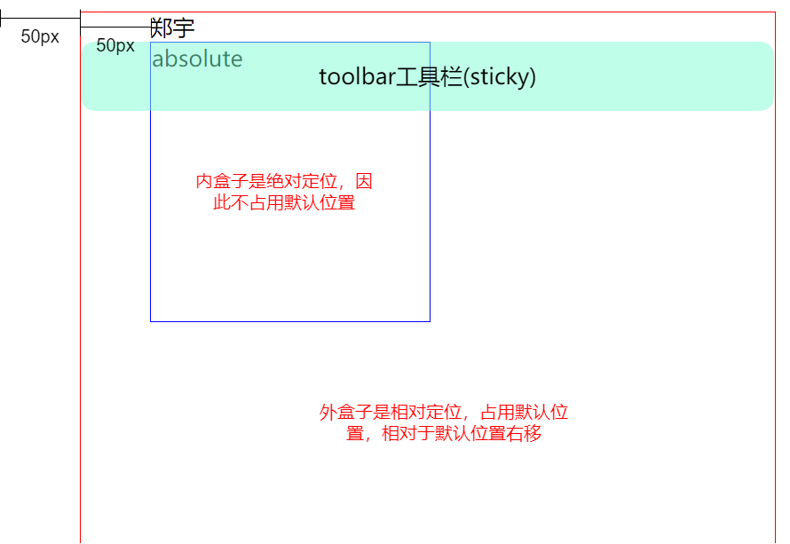
fixed 是一直固定在右下角: