
Appearance
CSS-Flex 布局
交互式 Flex 演示
1
2
3
4
5
6
Flex 容器
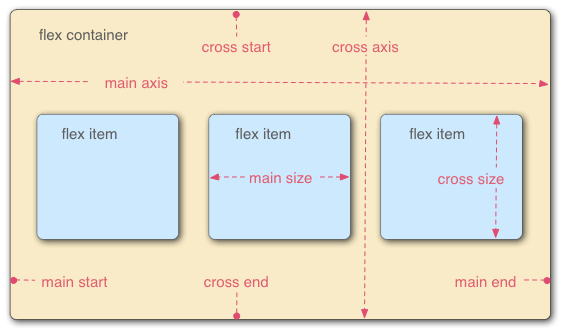
容器默认存在两根轴:水平的主轴(main axis)和垂直的交叉轴(cross axis)。主轴的开始位置(与边框的交叉点)叫做 main start,结束位置叫做 main end;交叉轴的开始位置叫做 cross start,结束位置叫做 cross end。
项目默认沿主轴排列。单个项目占据的主轴空间叫做 main size,占据的交叉轴空间叫做 cross size。
属性列举
容器属性是写在盒子的 CSS 中,而项目属性是写在盒子内部节点的 CSS 中。
容器属性:
- flex-direction:Flex 的方向
- row(默认):主轴为水平方向,起点在左端。
- row-reverse:主轴为水平方向,起点在右端。
- column:主轴为垂直方向,起点在上沿。
- column-reverse:主轴为垂直方向,起点在下沿。
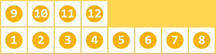
- flex-wrap:一行挤不下时候,是否换行
- nowrap(默认):不换行
- wrap:换行,第一行在上方
- wrap-reverse:换行,第一行在下方
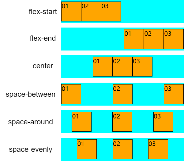
- justify-content:定义在主轴上的对齐方式
- stretch:均匀排列每个元素,非定宽高元素会被拉伸以适应容器的大小。
- flex-start:主轴起止位置对齐
- flex-end:主轴结束位置对齐
- center:居中
- space-between:均匀排列每个元素,首个元素放置于起点,末尾元素放置于终点,每两个元素距离相等。
- space-evenly:均匀排列每个元素,每两个元素距离相等。和 space-between 相比少了首尾元素的位置限制。
- space-around:均匀排列每个元素,每个元素周围分配相同的空间。下图中 01 和 02 的间距是 01 左侧间距的 2 倍。
- align-content:定义在 多条交叉轴 的对齐方式
- stretch
- flex-start
- flex-end
- center
- space-between
- space-evenly
- space-around
- align-items:对所有子项目在交叉轴方向按照指定方式排列
- stretch
- flex-start
- flex-end
- center
CAUTION
当 flex-wrap 为 nowrap 时,align-content 失效,align-items 生效;
当 flex-wrap 为 wrap 或 wrap-reverse 时,align-content 生效,align-items 失效。
项目属性:
- align-self:设置该项目在交叉轴方向按照指定方式排列
- stretch
- flex-start
- flex-end
- center
- order
- flex-grow 和 flex-shrink
- flex-basis
- 确定值
- auto
容器属性
flex-drection
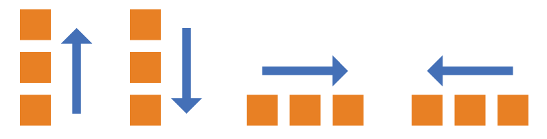
- flex-direction:Flex 的方向
- row(默认):主轴为水平方向,起点在左端。
- row-reverse:主轴为水平方向,起点在右端。
- column:主轴为垂直方向,起点在上沿。
- column-reverse:主轴为垂直方向,起点在下沿。
flex-wrap
- flex-wrap:一行挤不下时候,是否换行
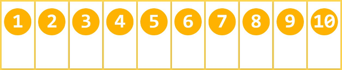
- nowrap(默认):不换行
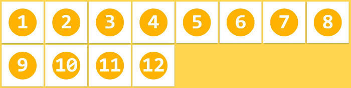
- wrap:换行,第一行在上方
- wrap-reverse:换行,第一行在下方
nowrap:
wrap:
wrap-reverse:
justify-content
flex-start 和 start 字段都是可以的,flex-start 是早期的 Flexbox 标准(Flexbox specification),W3C 正尝试建立盒子对齐标准(Box Alignment specification),start 将被用于取代 flex-start。
- justify-content:定义在主轴上的对齐方式
- stretch:均匀排列每个元素,非定宽高元素会被拉伸以适应容器的大小。
- flex-start:主轴起止位置对齐
- flex-end:主轴结束位置对齐
- center:居中
- space-between:均匀排列每个元素,首个元素放置于起点,末尾元素放置于终点,每两个元素距离相等。
- space-evenly:均匀排列每个元素,每两个元素距离相等。和 space-between 相比少了首尾元素的位置限制。
- space-around:均匀排列每个元素,每个元素周围分配相同的空间。下图中 01 和 02 的间距是 01 左侧间距的 2 倍。
align-content
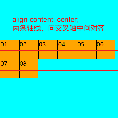
flex 布局是一维布局,在主轴上是排列元素的,排列的元素可以折行,因此 flex 只有一条主轴,但可以存在多条交叉轴。 align-content 生效的条件是必须要有多行轴线,因此只有当 flex-wrap 不为 nowrap 时候才会生效。
- align-content:定义在 多条交叉轴 的对齐方式
- stretch:均匀排列每个元素,非定宽高元素会被拉伸以适应容器的大小。
- flex-start:交叉轴起止位置对齐
- flex-end:交叉轴结束位置对齐
- center:居中
- space-between:均匀排列每个元素,首个元素放置于起点,末尾元素放置于终点,每两个元素距离相等。
- space-evenly:均匀排列每个元素,每两个元素距离相等。和 space-between 相比少了首尾元素的位置限制。
- space-around:均匀排列每个元素,每个元素周围分配相同的空间。下图中 01 和 02 的间距是 01 左侧间距的 2 倍。
align-items
align-content生效时候,该属性不生效
- align-items:对所有子项目在交叉轴方向按照指定方式排列
- stretch
- flex-start
- flex-end
- center
- baseline:项目的第一行文字的基线对齐
baseline 属性:
html
<div class="flex-box">
    <div class="box1">纸上得来终觉浅,绝知此事要躬行</div>
    <div class="box2">纸上得来终觉浅,绝知此事要躬行</div>
    <div class="box3">纸上得来终觉浅,绝知此事要躬行</div>
</div>
css
.flex-box {
    height: 300px;
    width: 300px;
    background-color: cyan;
    display: flex;
    flex-wrap: wrap;
    flex-direction: row;
    justify-content: center;
    /* align-content: center; */
    align-items: baseline;
}

.box1 {
    height: 120px;
    width: 50px;
    background-color: orange;
    border: 1px solid black;
}

.box2 {
    height: 150px;
    width: 50px;
    background-color: orange;
    border: 1px solid black;
    padding-top: 50px;
}

.box3 {
    height: 180px;
    width: 50px;
    background-color: orange;
    border: 1px solid black;
    padding-top: 20px;
}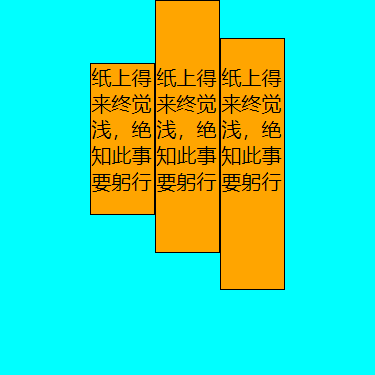
值得注意的是,该属性并不是指交叉轴的对齐方式,而是指子项目在交叉轴上的对齐方式。
当 flex-wrap 为 nowrap 时候,align-content 是不生效的,这时候只有一条交叉轴。这时候用 align-items 实现交叉轴上的对齐也是可以的。
比如要实现盒子的水平垂直方向居中,有两种方式:
- 使用 wrap+align-content 实现
html
<div class="flex-box">
    <div class="box-item">01</div>
</div>
css
.flex-box {
    height: 320px;
    width: 320px;
    background-color: cyan;
    display: flex;
    flex-direction: row;
    flex-wrap: wrap;
    justify-content: center;
    align-content: center;
}

.box-item {
    height: 50px;
    width: 50px;
    background-color: orange;
    border: 1px solid black;
}- nowrap 情况下使用 align-items 居中
css
.flex-box {
    height: 320px;
    width: 320px;
    background-color: cyan;
    display: flex;
    flex-direction: row;
    justify-content: center;
    align-items: center;
}
项目属性
align-self
CAUTION
当当 flex-wrap 为 wrap 或 wrap-reverse 时, align-content 生效。此时 align-self 是不生效的。
就是说 flex-wrap 为 nowrap 时候,align-items 和 align-self 才会生效。
- align-self:设置该项目在交叉轴方向按照指定方式排列
- stretch
- flex-start
- flex-end
- center
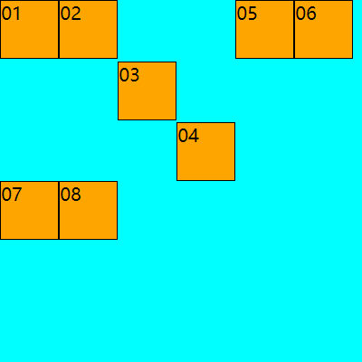
html
<div class="flex-box">
    <div class="box-item">01</div>
    <div class="box-item">02</div>
    <div class="box-item">03</div>
    <div class="box-item">04</div>
    <div class="box-item">05</div>
    <div class="box-item">06</div>
    <div class="box-item">07</div>
    <div class="box-item">08</div>
</div>
css
.flex-box {
    height: 320px;
    width: 320px;
    background-color: cyan;
    display: flex;
    flex-direction: row;
    flex-wrap: wrap;
    justify-content: flex-start;
    /* align-content: center; */
}

.box-item {
    height: 50px;
    width: 50px;
    background-color: orange;
    border: 1px solid black;
}

/* 第3个子元素在交叉轴上居中 */
.box-item:nth-child(3) {
    align-self: center;
}

/* 第4个子元素在交叉轴上居末 */
.box-item:nth-child(4) {
    align-self: flex-end;
}
flex
css
flex:none | <' flex-grow '> <' flex-shrink >'? || <' flex-basis '>order
规定弹性容器中的可伸缩项目在布局时的顺序。
order 默认为 0,可以为负数。越小越靠近主轴开始地方。
html
<div class="flex-box">
    <div class="box-item" style="order: 2;">01</div>
    <div class="box-item" style="order: -1;">02</div>
    <div class="box-item" style="order: 3;">03</div>
    <div class="box-item">04</div>
</div>
css
.flex-box {
    height: 60px;
    width: 320px;
    background-color: cyan;
    display: flex;
    flex-direction: row;
    flex-wrap: wrap;
    justify-content: space-between;
    align-content: center;
}

.box-item {
    height: 50px;
    width: 50px;
    background-color: orange;
    border: 1px solid black;
}
flex-grow 和 flex-shrink
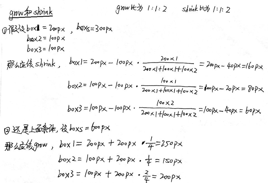
flex-basis
指定了 flex 元素在主轴方向上的初始大小,然后 flex-grow 和 flex-shrink 再基于这个基础进行伸缩。
html
<div class="flex-box">
    <div class="box-item">01</div>
    <div class="box-item">02</div>
    <div class="box-item">03</div>
</div>
css
.flex-box {
    height: 60px;
    width: 300px;
    background-color: cyan;
    display: flex;
    flex-wrap: wrap;
    flex-direction: row;
    justify-content: center;
    align-content: center;
}

.box-item {
    height: 50px;
    width: 50px;
    background-color: orange;
    border: 1px solid black;
}

.box-item:nth-child(2) {
    flex-basis: 100px;
}

.box-item:nth-child(3) {
    flex-basis: 20px;
}