
Appearance
CSS布局实例
CSS常用的布局,搭建页面必会的结构
居中
水平居中
1.行内元素
css
span {
  text-align: center;
}
缺点:该属性会发生继承,子元素宽度大于父元素宽度时候无效,小于父元素宽度时水平居中生效。
2.单个块级元素
css
div {
  /* 必须定宽,也可以是fit-content */
  width: 100px;
  margin: 0 auto;
}
缺点:必须定宽,且width值不能为auto;宽度必须小于父元素。
3.多个块元素
让多个块元素变成行内块元素,然后通过text-align让行内内容居中。
less
#parent {
  text-align: center;
  .son {
    display: inline-block
  }
}
缺点:只对行内内容有效;text-align会继承;block改为inline-block换行、空格会产生元素间隔。
4.position
先让元素左上角定位到相对父元素居中位置,再折回自身宽度一半,让元素整体定位到居中位置。
less
/* 父元素为相对定位,子元素为绝对定位 */
#parent{
  height: 200px;
  width: 200px;
  position: relative;
  .son {
    position: absolute;
    /* 父元素宽度一半,元素左上角定位到居中位置 */
    left: 50%;
    /* 折回自身宽度一半,元素整体定位到居中位置 */
    transform: translateX(-50%);
    width: 100px;
    height: 100px;
    background-color: #00ff00;
  }
}
缺点:代码较多;脱离文档流;需要知道宽度值。
5.flex
通过flex布局让其在主轴方向居中对齐
css
#parent{
  display: flex;
  justify-content: center;
}
垂直居中
1.行内元素
让高度和行高等值
css
#parent{
  height: 150px;
  /* 必须与height等值 */
  line-height: 150px;
}
缺点:只能用于单行内容;要知道高度的值。
如果是多行,行高=高度/元素个数
css
/* 现在有五个元素, */
#parent{
  height: 150px;
  line-height: 30px;
}
缺点:只能用于行内内容;需要知道高度和最终呈现多少行来计算出line-height的值,建议用span包裹多行文本。
2.图片
less
#parent{
  height: 150px;
  line-height: 150px;
  /* 没有font-size: 0;就不是完全的垂直居中 */
  font-size: 0;
  /* 默认是基线对齐,改为middle */
  img {
    vertical-align: middle;
  }
}缺点:需要添加font-size: 0;才可以完全的垂直居中;熟悉line-height 和vertical-align的基友关系较难
3.position
和水平居中原理相同
4.flex
通过flex布局让其在交叉轴方向居中对齐
css
#parent{
  display: flex;
  align-items: center;
}
水平垂直居中
通过结合上述水平居中和垂直居中的实现方式完成一些常见的水平垂直居中布局,未出现的方式可在评论中补充,方便一起学习。注意注意,上述任何水平居中和垂直居中方式不是随意组合就能生效,这个需详细分析可行性。通过一些组合就能成功得到水平垂直居中布局。
全屏布局
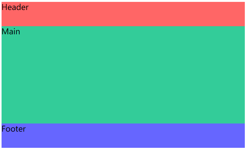
经典的全屏布局由顶部、底部、主体三部分组成,其特点为三部分左右满屏拉伸、顶部底部高度固定和主体高度自适应,主要应用在主体布局。该布局很常见,也是大部分Web应用主体的主流布局。通常使用<header>、<footer>和<main>三个标签语义化排版,<main>内还可插入<aside>作为侧栏。
position + left/right/top/bottom
html
<style>
    .fullscreen-layout {
        position: relative;
        width: 500px;
        height: 300px;
    }

    header,
    footer,
    main {
        position: absolute;
        left: 0;
        right: 0;
    }

    header {
        top: 0;
        height: 50px;
        background-color: #f66;
    }

    footer {
        bottom: 0;
        height: 50px;
        background-color: #66f;
    }

    main {
        top: 50px;
        bottom: 50px;
        background-color: #3c9;
    }
</style>

<body>
    <div class="fullscreen-layout">
        <header>Header</header>
        <main>Main</main>
        <footer>Footer</footer>
    </div>
</body>这里解释下为啥left: 0;和right: 0;同时存在,这个是之前的理解有误
一个盒子的大小正常情况下是由width和height决定的,但如果缺少,则是由top、bottom、left、rigth坐标确定的
比如本例中没有width,那么就由left、rigth决定,由于它们都是0,因此左边压着fullscreen-layout盒子的左边界,右边压着fullscreen-layout盒子的右边界
flex
html
<style>
    .fullscreen-layout {
        display: flex;
        flex-direction: column;
        width: 500px;
        height: 300px;
    }

    header {
        height: 50px;
        background-color: #f66;
    }

    footer {
        height: 50px;
        background-color: #66f;
    }

    main {
        flex: 1;
        background-color: #3c9;
    }
</style>

<body>
    <div class="fullscreen-layout">
        <header>Header</header>
        <main>Main</main>
        <footer>Footer</footer>
    </div>
</body>用弹性盒子确定header和footer的高度,然后让main部分自动适配,flex-grow:1是独占弹性盒子的剩余空间
两列布局
float + margin-left/right
html
<style>
    .two-column-layout{
        width: 400px;
        height: 400px;
    }
    .left{
        float: left;
        width: 100px;
        height: 100%;
        background-color: #f66;
    }
    .right{
        margin-left: 100px;
        height: 100%;
        background-color: #66f;
    }
</style>

<body>
    <div class="two-column-layout">
        <div class="left">Left</div>
        <div class="right">Right</div>
    </div>
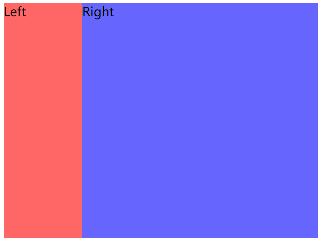
</body>left是浮动且宽度确定的,right必须有**margin-left: 100px;**,是让浮动的区域为空,没有这个是蓝色扩展到整个盒子,然后红色覆盖了那一部分
overflow + float
html
<style>
    .two-column-layout{
        width: 400px;
        height: 400px;
    }
    .left{
        float: left;
        width: 100px;
        height: 100%;
        background-color: #f66;
    }
    .right{
        /*修改处*/
        overflow: hidden;
        height: 100%;
        background-color: #66f;
    }
</style>

<body>
    <div class="two-column-layout">
        <div class="left">Left</div>
        <div class="right">Right</div>
    </div>
</body>左列声明同上,右列声明overflow:hidden使其形成BFC区域与外界隔离
flex
html
<style>
    .two-column-layout{
        display: flex;
        width: 400px;
        height: 300px;
    }
    .left{
        width: 100px;
        background-color: #f66;
    }
    .right{
        flex: 1;
        background-color: #66f;
    }
</style>

<body>
    <div class="two-column-layout">
        <div class="left">Left</div>
        <div class="right">Right</div>
    </div>
</body>
弹性盒子,left占好位置,然后right适配即可
标准三列布局
overflow + float
html
<style>
    .three-column-layout {
        width: 400px;
        height: 300px;
    }

    .left {
        float: left;
        width: 100px;
        height: 100%;
        background-color: #f66;
    }

    .center {
        float: left;
        width: 100px;
        height: 100%;
        background-color: #66f;
    }

    .right {
        overflow: hidden;
        height: 100%;
        background-color: #3c9;
    }
</style>

<body>
    <div class="three-column-layout">
        <div class="left">Left</div>
        <div class="center">Center</div>
        <div class="right">Right</div>
    </div>
</body>
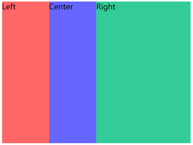
这种三列布局有局限性,就是必须left和center宽度是确定的,没有用flex的方式好
flex
html
<style>
    .three-column-layout{
        display: flex;
        width: 400px;
        height: 300px;
    }
    .left{
        width: 100px;
        background-color: #f66;
    }
    .center{
        width: 100px;
        background-color: #66f;
    }
    .right{
        flex-grow: 1;
        background-color: #3c9;
    }
</style>

<body>
    <div class="three-column-layout">
        <div class="left">Left</div>
        <div class="center">Center</div>
        <div class="right">Right</div>
    </div>
</body>
左右宽度固定,中间任意适配
圣杯布局和双飞翼布局
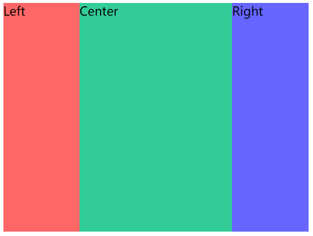
经典的圣杯布局和双飞翼布局都是由左中右三列组成,其特点为左右两列宽度固定、中间一列宽度自适应和三列高度固定且相等。其实也是上述两列布局和三列布局的变体,整体的实现原理与上述N列布局一致,可能就是一些细节需注意。
圣杯布局和双飞翼布局在大体相同下也存在一点不同,区别在于双飞翼布局中间列需插入一个子节点。在常规的实现方式中也是在这个中间列里做文章,如何使中间列内容不被左右列遮挡。
相同
中间列放首位且声明其宽高占满父节点
被挤出的左右列使用
float和margin负值将其拉回与中间列处在同一水平线上不同
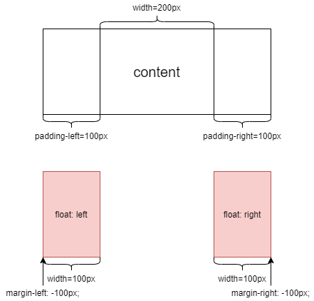
圣杯布局:父节点声明
padding为左右列留出空位,将左右列固定在空位上双飞翼布局:中间列插入子节点并声明
margin为左右列让出空位,将左右列固定在空位上
圣杯布局float + margin-left/right + padding-left/right
html
<style>
    .grail-layout {
        padding: 0 100px;
        width: 200px;
        height: 300px;
    }

    .left {
        float: left;
        margin-left: -100px;
        width: 100px;
        height: 100%;
        background-color: #f66;
    }

    .center {
        height: 100%;
        background-color: #3c9;
    }

    .right {
        float: right;
        margin-right: -100px;
        width: 100px;
        height: 100%;
        background-color: #66f;
    }
</style>

<body>
    <div class="grail-layout">
        <div class="left">Left</div>
        <div class="right">Right</div>
        <div class="center">Center</div>
    </div>
</body>在盒子中让Left部分左浮动,让Right部分右浮动,注意要将margin取负数,设置宽度width刚好等于这个数
由于浮动节点在位置上不能高于前面或平级的非浮动节点,否则会导致浮动节点下沉。因此在编写HTML结构时,将中间列节点挪到右列节点后面。
双飞翼布局float + margin-left/right
html
<style>
    .grail-layout{
        width: 400px;
        height: 300px;
    }
    .left{
        float: left;
        width: 100px;
        height: 100%;
        background: #f66;
    }
    .right{
        float: right;
        width: 100px;
        height: 100%;
        background: #66f;
    }
    .center{
        height: 100%;
        margin: 0 100px;
        background: #3c9;
    }
</style>

<body>
    <div class="grail-layout">
        <div class="left">Left</div>
        <div class="right">Right</div>
        <div class="center">Center
            <div>纸上得来终觉浅,绝知此事要躬行。</div>
        </div>
    </div>
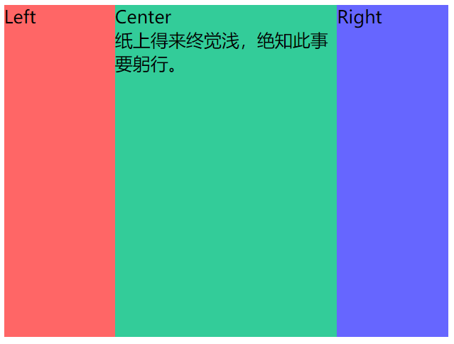
</body>圣杯布局是要Center独占容器,因此有margin-left: -100px;而双飞翼布局是三个部分共同占用容器,三者的宽度加起来刚好等于容器宽度
圣杯布局/双飞翼布局flex
html
<style>
    .grail-layout{
        width: 400px;
        height: 300px;
        display: flex;
    }
    .left{
        width: 100px;
        background: #f66;
    }
    .center{
        flex: 1;
        background: #3c9;
    }
    .right{
        width: 100px;
        background: #66f;
    }
</style>
<body>
    <div class="grail-layout">
        <div class="left">Left</div>
        <div class="center">Center
            <div>纸上得来终觉浅,绝知此事要躬行。</div>
        </div>
        <div class="right">Right</div>
    </div>
</body>
均分布局
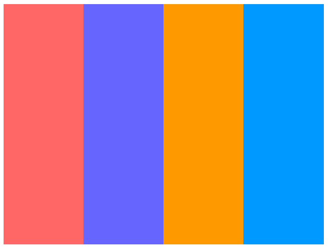
经典的均分布局由多列组成,其特点为每列宽度相等和每列高度固定且相等。总体来说,也是最简单的经典布局,由于每列宽度相等,所以很容易找到合适的方式处理。
float + width
html
<style>
    .one {
        background-color: #f66;
    }

    .two {
        background-color: #66f;
    }

    .three {
        background-color: #f90;
    }

    .four {
        background-color: #09f;
    }

    .average-layout {
        width: 400px;
        height: 300px;
    }

    div {
        float: left;
        width: 25%;
        height: 100%;
    }
</style>
<body>
    <div class="average-layout">
        <div class="one"></div>
        <div class="two"></div>
        <div class="three"></div>
        <div class="four"></div>
    </div>
</body>
让每块都在盒子中浮动即可,然后计算出每个占用的宽度比
column
使用column实现会令CSS代码语义化更明确。column相关属性是为列排版应运而生的,相对flex相关属性来说更易懂易学。
css
.average-layout {
    column-count: 4;
    column-gap: 0;
    width: 400px;
    height: 300px;
}
div {
    height: 100%;
}
原生的column布局,非常适合
flex
css
.average-layout {
    display: flex;
    width: 400px;
    height: 400px;

}
div {
    flex: 1;
}在一个弹性盒子中,按照1:1:1:1分割
文字布局
文字环绕
html
<style>
  .text-wrapping {
    /* 溢出部分设置被隐藏 */
    overflow: hidden;
    width: 400px;
    height: 300px;
    font-size: 20px;
    color: #f66;
    /* 对任意字符换行 */
    word-break: break-all;
  }

  img {
    float: left;
    margin: 10px;
    height: 200px;
  }
</style>

<body>
  <div class="text-wrapping">
    <img src="https://static.yangzw.vip/codepen/thor.jpg">
XXXXXXXXXXXXXXXXXXXXXXXXXXXXXXXXXXXXXXXXXXXXXXXXXXXXXXXXXXXXXXXXXXXXXXXXXXXXXXXXXXXXXXXXXXXXXXXXXXXXXXXXXXXXXXXXXXXXXXXXXXXXXXXXXXXXXXXXXXXXXXXXXXXXXXXXXXXXXXXXXXXXXXXXXXXXXXXXXXXXXXXXXXXXXXXXXXXX
  </div>
</body>
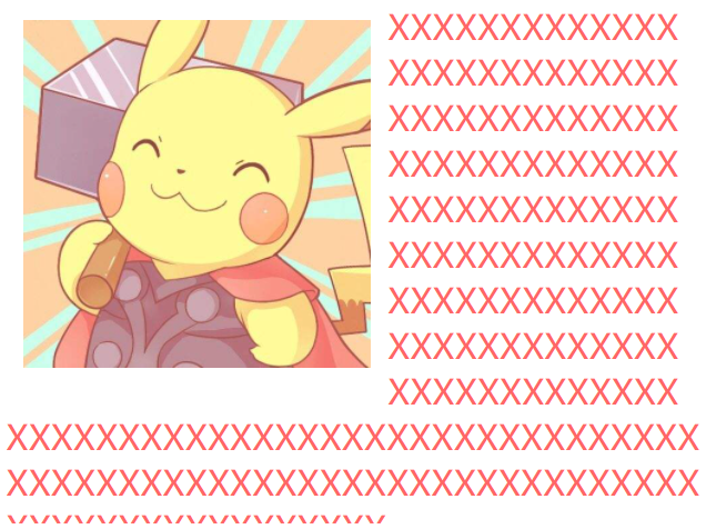
关键点:
- 让图片浮动
- 字符可以换行
至于溢出部分是hidden还是scroll这个自行选择
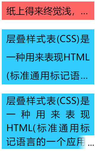
文字溢出
单行文字溢出
css
.s-ellipsis {
    /* 溢出容器部分隐藏 */
    overflow: hidden;
    /* 当内联内容溢出块容器时将溢出部分变成… */
    text-overflow: ellipsis;
    /* 指定文本超过边界时不换行 */
    white-space: nowrap;
}
多行文字溢出
css
.m-ellipsis {
    /* 将容器作为弹性伸缩盒模型 */
    display: -webkit-box;
    overflow: hidden;
    text-overflow: ellipsis;
    word-break: break-all;
    /* 弹性伸缩盒模型子节点的排列方式为纵向 */
    -webkit-box-orient: vertical;
    /* 限制容器最多显示3行文本 */
    -webkit-line-clamp: 3;
}
最后带有点修边的:
css
.m-ellipsis2 {
    overflow: hidden;
    position: relative;
    max-height: 120px;
    /* 行高 */
    line-height: 30px;
}

.m-ellipsis2::after {
    /* 绝对定位 */
    position: absolute;
    right: 0;
    bottom: 0;
    padding-left: 20px;
    /* 渐变色 */
    background: linear-gradient(to right, transparent, #fff 50%);
    content: "...";
}
完整代码
html
<!DOCTYPE html>
<html lang="en">

<head>
    <meta charset="UTF-8">
    <meta http-equiv="X-UA-Compatible" content="IE=edge">
    <meta name="viewport" content="width=device-width, initial-scale=1.0">
    <title>CSS艺术之美</title>
    <style>
        .text-ellipsis {
            width: 200px;
        }

        p {
            padding: 0 10px;
            line-height: 40px;
            text-align: justify;
            font-size: 20px;
            color: rgb(0, 0, 0);
        }

        .s-line {
            background-color: #f66;
        }

        .m-line {
            background-color: #3cf;
        }

        .s-ellipsis {
            /* 溢出容器部分隐藏 */
            overflow: hidden;
            /* 当内联内容溢出块容器时将溢出部分变成… */
            text-overflow: ellipsis;
            /* 指定文本超过边界时不换行 */
            white-space: nowrap;
        }

        .m-ellipsis {
            /* 将容器作为弹性伸缩盒模型 */
            display: -webkit-box;
            overflow: hidden;
            text-overflow: ellipsis;
            word-break: break-all;
            /* 弹性伸缩盒模型子节点的排列方式为纵向 */
            -webkit-box-orient: vertical;
            /* 限制容器最多显示3行文本 */
            -webkit-line-clamp: 3;
        }

        .m-ellipsis2 {
            overflow: hidden;
            position: relative;
            max-height: 120px;
            /* 行高 */
            line-height: 30px;
        }

        .m-ellipsis2::after {
            /* 绝对定位 */
            position: absolute;
            right: 0;
            bottom: 0;
            padding-left: 20px;
            /* 渐变色 */
            background: linear-gradient(to right, transparent, #fff 50%);
            content: "...";
        }
    </style>
</head>

<body>
    <div class="text-ellipsis">
        <p class="s-line s-ellipsis">纸上得来终觉浅,绝知此事要躬行</p>
        <p class="m-line m-ellipsis">
            层叠样式表(CSS)是一种用来表现HTML(标准通用标记语言的一个应用)或XML(标准通用标记语言的一个子集)等文件样式的计算机语言。CSS不仅可以静态地修饰网页,还可以配合各种脚本语言动态地对网页各元素进行格式化。
        </p>
        <p class="m-line m-ellipsis2">
            层叠样式表(CSS)是一种用来表现HTML(标准通用标记语言的一个应用)或XML(标准通用标记语言的一个子集)等文件样式的计算机语言。CSS不仅可以静态地修饰网页,还可以配合各种脚本语言动态地对网页各元素进行格式化。
        </p>
    </div>
</body>

</html>